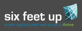
Six Feet Up Unveils New Logo, Color Scheme & Branding
Six Feet Up unveils today a new logo, color scheme and branding elements, all of which bring together the past and future of the eleven year old open source software company.
 Six Feet Up's new logo reflects the positioning of the company as a leading provider of complex web software in the fields of content management systems, knowledge management systems and web applications. The new logo salutes the large projects the firm has been conducting for organizations, such as IEEE IT Society, Indiana Historical Society, Open Society Foundations, Oxfam, University of Virginia, etc.
The new logo pays homage to the 10+ years of existence of the company by keeping the firm's brand name in lower case letters, "six feet up", and using the font that has represented Six Feet Up's brand image since 1999. The previously used "up" device is now replaced by an organic shape with many crossing lines and various shades of blue illustrating the complexity of the projects the firm takes on. The message is reinforced by a new tagline: "where sophisticated web projects thrive". The shape features an upward movement to convey the success in Six Feet Up's projects.
The new color scheme continues to be centered around blues and greens, but now leverages dark grays to accentuate the colors. For instance, Six Feet Up's main three solutions (Content Management Systems implementation, Knowledge Management System deployment, and custom web application development) are now emphasized using different bright colors on the upcoming new website, to be unveiled later this year.
The simple, yet sleek, design of the Six Feet Up new logo and upcoming website are the result of a 3-month creative and marketing collaboration between Six Feet Up and Abstract Edge, the firm's long-term design and branding partner.
Thanks for filling out the form! A Six Feet Up representative will be in contact with you soon.
